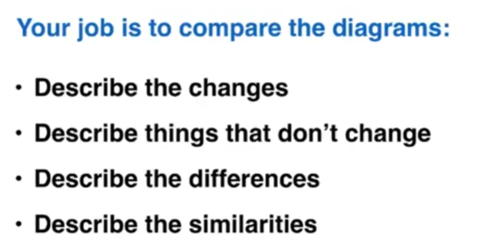
The task is to describe what you see. Writing a report.
- Don't give opinions.
- No conclusion. instead of writing a summary. (the overview)
Question types
- Line graph
- Bar chart
- Pie chart
- Table
- Diagram - comparing
- Diagram - process
(maps are included in number 5. or number 6.)
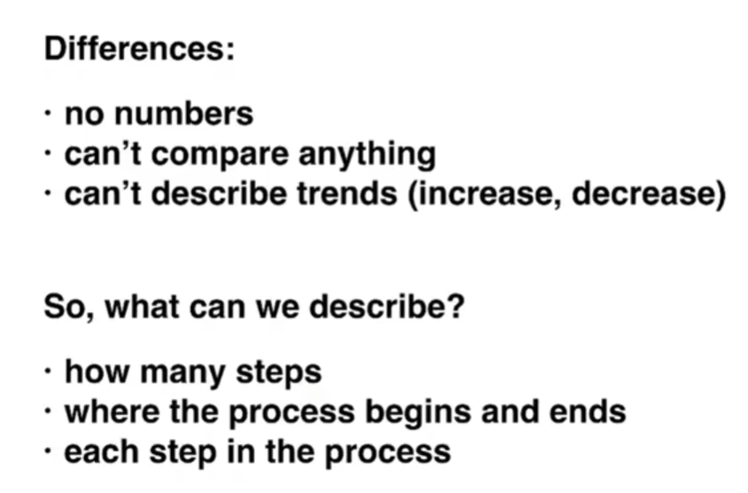
1~4 they all show numbers, and have to describe one number. If they have more than one number, need to know how to compare numbers in a sentence. To describe the changes/trends.(increase or decrease)
Essay structure
- Introduction
1 sentence: Paraphrase the question (changing the question use your word)
- Overview
2 sentence: The main, general things
- Details
- Details
3-4 describe, compare the higher numbers in one paragraph and the lower numbers in another paragraph
Line graphs
First, make a very general comparisons.(Summary / overview paragraph)
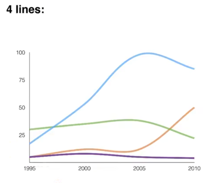
The blue line is the **highest **overall, is higher than the other lines overall. In the whole period shown very very general.
Second, compare the lines at specific points.(details paragraphs 3,4)
Write at least one thing about each line.
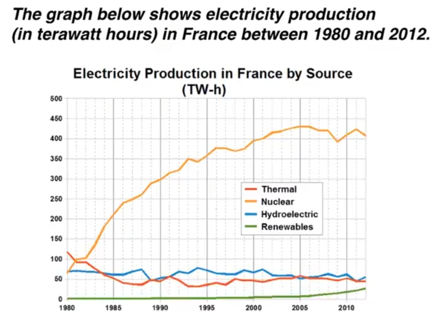
Introduction - paraphrase the question
The line graph compares the amount of electricity produced in France using four different sources of power over a period of 32 years.
Overview - 2 sentences, 2 main points
It is clear that nuclear power was by far the most important means of electricity generation over the period shown. Renewables provided the lowest amount of electricity in each year.
Details - 2 paragraphs, compare the lines
Paragraph 3
In 1980, the thermal power stations were the main source of electricity in France, generating around 120 terawatt hours of power. Nuclear and hydroelectric power stations produced just under 75 terawatt hours of electricity each, and renewables provided a negligible amount. Just one year later, nuclear power overtook thermal power as the primary source of electricity.
Paragraph 4
Between 1980 and 2005, electricity production from nuclear power rose dramatically to peak of 430 terawatt hours. By contrast, the figure for thermal power fell to only 50 terawatt hours in 1985, and remained at this level for the rest of the period. Hydroelectric power generation remained relatively stable, at between 50 and 80 terawatt hours, for the whole 32-year period,but renewable electrictiy production saw only a small rise to approximately 25 terawatt hours by 2012.
**Vocabulary: ** paraphrasing, comparing, describing changes
- amount of electricity produced
- source of / provided / generating
- means of electricity generation
- over a period of / over the period shown
- by far the most important
- a negligible amount
- nuclear power overtook thermal power
- rose dramatically to a peak of
- by contrast
- the figure for
- remained at this level, remained stable
- saw on a small rise
Bar charts
This type of bar chart is the same as a line graph.
First , make a very general comparison( summary / overview paragraph)
Second , compare specific numbers.(details paragraphs 3,4)
Introduction - paraphrase the question
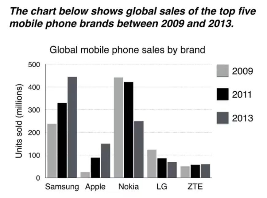
The bar chart compares the number of mobile phones sold worldwide by the five most popular manufacturers in the years 2009, 2011 and 2013.
Overview - 2 sentences, 2 main points
It is clear that Nokia sold the most mobile phones between 2009 and 2011, but Samsung became the best selling brand in 2013. Samsung and Apple saw the biggest rises in sales over 5-year period.
Details - 2 paragraphs, compare the bars
Paragraph 3: comparisions, changes over time
In 2009, Nokia sold close to 450 million mobile phones, which was almost double the number of handsets sold by the second most successful manufacturer, Samsung. Over the following four years, however, Nokia's sales figures fell by approximately 200 million units, whereas Samsung saw sales rise by a similar amount. By 2013, Samsung had become the market leader with sales reaching 450 units.
Paragraph 4: comparisions, changes over time
The other three top selling moblie phone brands between 2009 and 2013 were LG, ZTE and Apple. In 2009, these companies sold around 125 million, 50 million and 25 million mobile handsets respectively, but Apple overtook the other two vendors in 2011. In 2013, purchases of Apple handsets reached 150 million units, while LG saw declining sales and the figures for ZTE rose only slightly.
Vocabulary: paraphrasing, comparing, describing changes
- sold worldwide
- sales figures, purchases
- most popular, best selling brand, top selling
- market leader
- mobile phones, handsets, units
- brands, manufacturers, companies, vendors
- saw the biggest rises, saw declining sales
- close to, almost, approximately, around
- double the number
- rise by a similar amount
- respectively
- overtook the other two venders
Pie charts
Pie charts can show numbers, but they always show percentages.

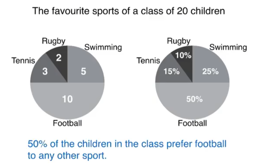
Half of the class said that football was their favourite sport.
Around 50% of the children in the class prefer football to any other sport.
Remember: the full pie is always 100%
Pie charts can show changes over time (e.g. years) But pie chart don't always show changes over time

Your job is to compare the percentages (and numbers)
First , make a very general comparison( summary / overview paragraph )
Second , compare specific numbers.(details paragraphs 3,4)

Introduction - paraphrase the question
The pie charts compare five categories of household expenditure and the UK and New Zealand in the years 1980 and 2008.
Overview - 2 sentences, 2 main points
It is noticeable that the proportion of spending on food and drink fell in both countries over the 28-year period, while spending on utility bills rose. Also, UK residents spent a significantly larger percentage of their household budgets on leisure than their New Zealand counterparts.
Paragraph 3 2 categories
In 1980, 29% of an average New Zealand household budget went on food and drink, while the equivalent figure for a UK home was 23%. By 2008, expenditure on food and drink had fallen by 4% in New Zealand, and by a full 10% in the UK. By contrast, both countries saw an increase in expenditure on utility bill for the average home, from 27% to 31% in New Zealand and from 26% to 28% in the UK.
Paragraph 4 3 categories
Leisure activities accounted for the highest proportion of UK household spending in both years, but only the third highest proportion in New Zealand. In fact, in 2008, New Zealanders spent only half as much in relative terms on recreation (17%) as UK residents (34%). In both countries, transport costs and other costs took roughly 15% and 10% of household budgets respectively.
Vocabulary: paraphrasing, comparing, describing changes
- spending, expenditure, spent, costs
- proportion of spending
- percentage of household budget
- the equivalent figure for a UK home
- fell, rose, saw an increase in
- by 2008, expenditure had fallen
- spent a significantly larger percentage
- than their New Zealand counterparts
- 29% of an average household budget went on
- while, by contrast
- leisure accounted for the highest proportion
- spent half as much in relative terms
Tables
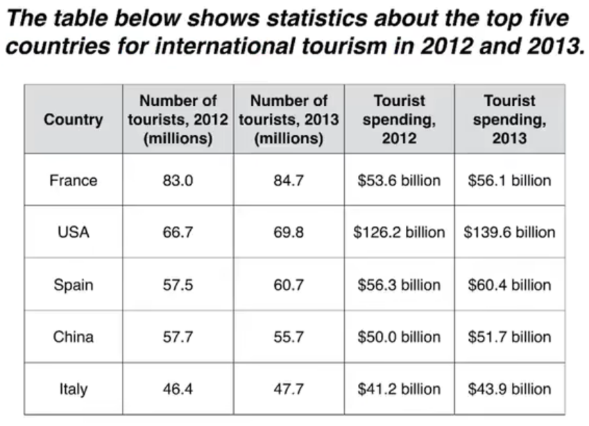
Introduction - paraphrase the question
The table compares the five highest ranking countries in terms of the numbers of visits and the money spent by tourists over a period of two years.
Overview - 2 sentences, 2 main points
It is clear that France was the world's most popular tourist destination in the years 2012 and 2013. However, the USA earned by far the most revenue from tourism over the same period.
Paragraph 3
In 2012, 83 million tourists visited France, and the USA was the second most visited country, with 66.7 million tourists. Spain and China each received just under 58 million visitors, while Italy was ranked fifth with 46.4 million tourists. 2013 saw a rise of between 1 and 4 million tourist visits to each country, with the exception of China, which received 2 million fewer visitors than in the previous year.
Paragraph 4 3 sentences
Spending by tourists visiting the USA increased from $126.2 billion in 2012 to $139.6 billion in 2013, and these figures were well over twice as high as those for any other country. Spain received the second highest amounts of tourist revenue, rising from $56.3 billion to $60.4 billion, followed by France, China and Italy. Interestingly, despite falling numbers of tourists, Chinese revenue from tourism rose by $1.7 billion in 2013.
Vocabulary: paraphrasing, comparing, describing changes
- five highest ranking countries
- the world's most popular tourist destination
- earned by far the most
- revenue from tourism
- the second most visited country
- received... visitors
- ranked fifth
- 2013 saw a rise of
- fewer visitors than in the previous year
- these figures were well over twice as high as
- amount of tourist revenue
- despite falling numbers
- despite falling numbers
- saw a rise, increased rising from, rose by
2 different charts
These are questions with 2 different charts, which you can't compare together.

First, look for one main feature in each chart. (Summary / overview paragraph)
Second, describe specific numbers for each chart separately ('details' paragraphs)
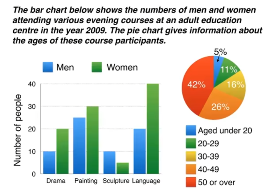
Introduction - paraphrase the question
The bar chart compares the numbers of men and women who took four different evening classes in 2009, and the pie chart shows the age profile of these attendees.
Overview - 2 sentences, 2 main points
It is clear that significantly more women than men attended evening classes at the education centre. We can also see that evening courses were much more popular among older adults.
Paragraph 3
According to the bar chart, drama, painting and language courses all attracted more women than men to the education centre in 2009. Language classes had the highest number of participants overall, with 40 female and 20 male students, while painting was a popular choice among both genders, attracting 30 female and 25 male attendees. The only course with a higher number of males was sculpture, but this course was taken by a mere 15 people in total.
Paragraph 4
Looking at the age profile pie chart, we can see that the majority of people attending evening lessons were over 40 years of age. To be precise, 42% of them were aged 50 or more, and 26% were aged between 40 and 49. Younger adults were in the minority, with only 11% of students aged 20 to 29, and only 5% aged under 20.
Vocabulary: paraphrasing, comparing, describing changes
- attending courses, who took classes
- participants, attendees, students
- males and females
- courses attracted more women
- a popular choice among both genders
- significantly more higher, highest
- had the highest number, with (+ number)
- was taken by a mere 15 people
- According to the bar chart,
- Look at the age profile pie chart,
- were in the minority
- the majority of people
- To be precise
Process diagram
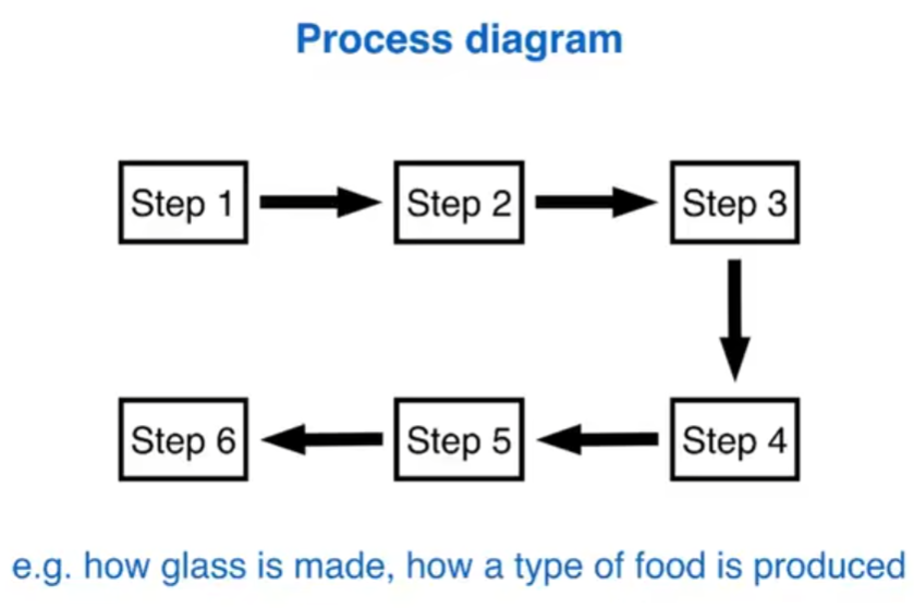
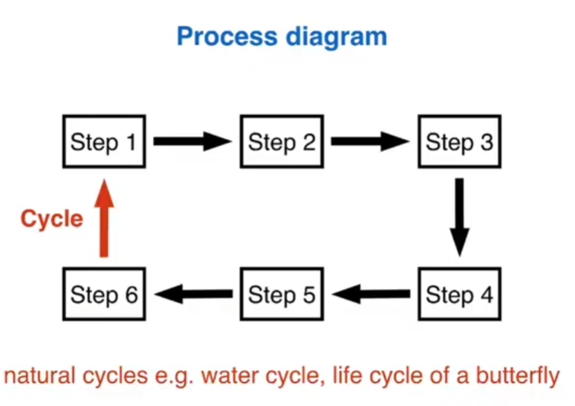
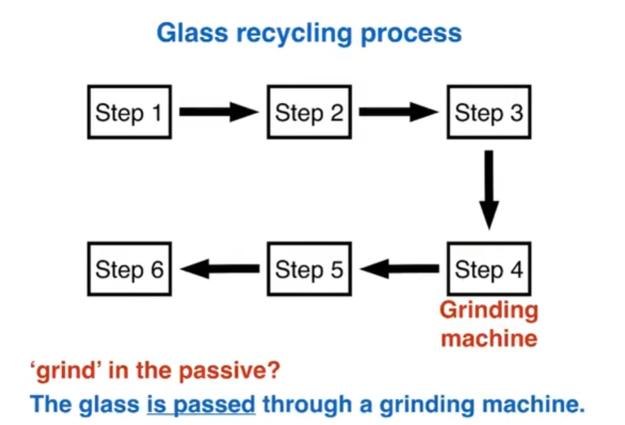
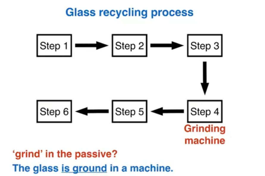
Note: maps can also show processes
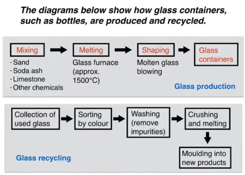
Introduction - paraphrase the question
The first flow diagram illustrates the process of glass container production, and the second diagram shows step in the process of recycling used glass.
Overview - 2 sentences, 2 main points
We can see that glass is made using three main raw materials, and that the manufacturing process consists of four distinct stages. It requires five steps to turn used glass into new glass products.
Paragraph 3
At the first stage in the production of glass, sand, soda ash, limestone and other chemicals are mixed together. Next, this mixture is heated in a glass furnace at approximately 1500°C to produce molten glass. The molten glass can then be shaped, by blowing, to create the end products, namely glass containers.
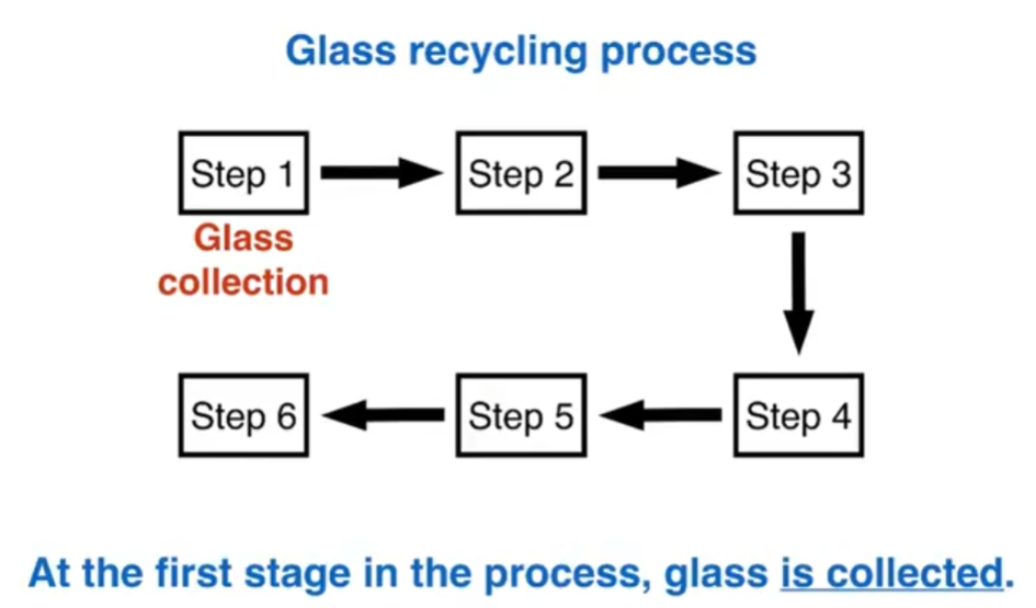
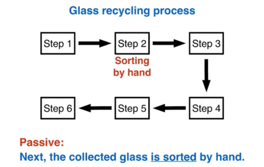
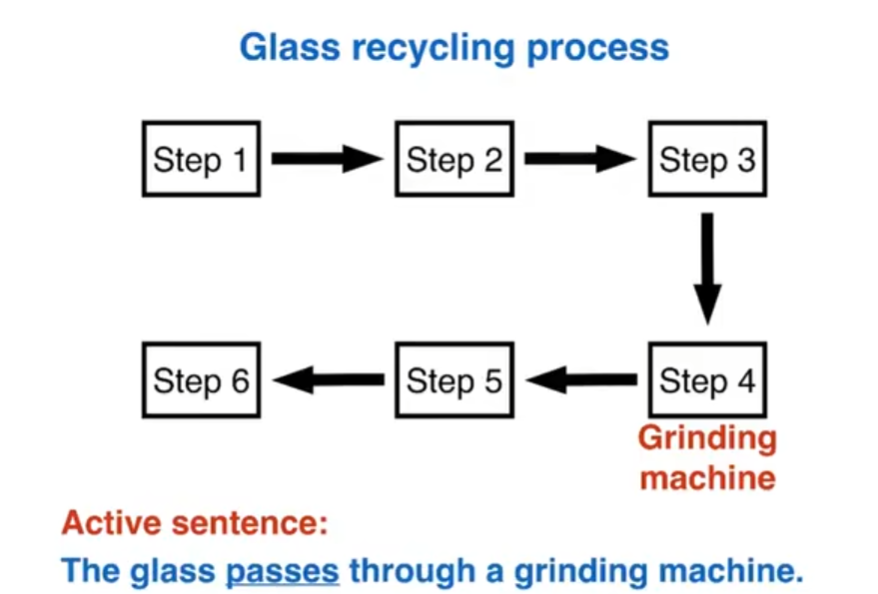
Paragraph 4
Glass recycling begins with the collection of used glass products. The collected glass is sorted according to its colour, and then washed in order to remove any impurities. At the fourth stage of recycling, the glass is crushed and melted, and the resulting molten glass can finally be molded to create new items.
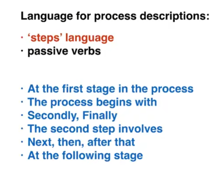
Vocabulary: paraphrasing, steps, passive verbs
- steps / stages in the process of
- consists of four distinct stages
- it requires five steps
- raw materials, end products
- production, manufacturing
- turn used glass into new products
- at the first stage, next, then, begins with
- are mixed, is heated, can be shaped
- is sorted according to
- can be moulded to create
- are mixed → this mixture
- collection → the collected glass
- is melted → the resulting molten glass
comparison diagram


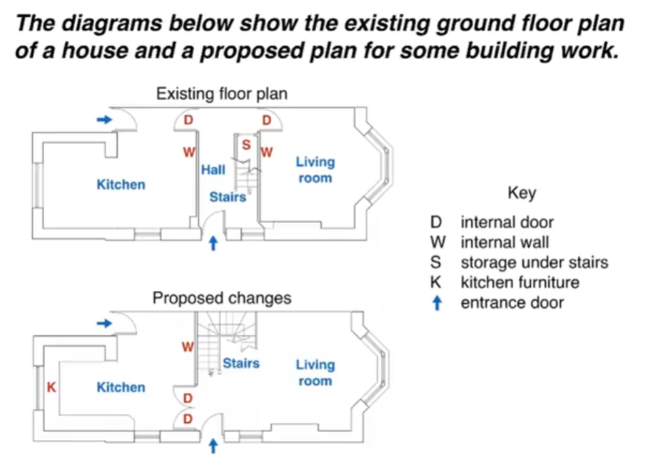
Introduction - paraphrase the question
The two pictures compare the current layout of the ground floor of a house with a plan to redesign the same living space.
Overview - 2 sentences, 2 main points
We can see that the new design proposal involves making a number of changes to the ground floor of the house, mainly in the central hall area. There are no plans to change external walls or entrances.
Paragraph 3
The most noticeable change from the existing to the proposed floor plan is that there will no longer be a separate hall area when the building work has been done. This will be achieved by removing the internal wall and door between the hall and living room, along with the current staircase and understair storage cupboard. With no separate hall area, the proposed living room will also contain the staircase to the first floor.
Paragraph 4
To replace the current straight staircase, a new set of winding stairs will be installed in the corner of the living room. The internal door between the hall and kitchen will also be replaced with double doors connecting the kitchen with the new living room. Finally the planned building work will also include the installation of some kitchen furniture.
Vocabulary: paraphrasing, verbs, description of changes
- existing plan → current layout
- proposed plan → plan to redesign
- design proposal, planned building work
- there will no longer be
- this will be achieved by removing
- will also contain, will also include
- will be installed, will be replaced
- the design proposal involves
- when the building work has been done
- living space, central hall area, staircase
- under-stair storage cupboard
- a new set of winding stairs
maps, summary

- Some maps are the same as 'comparison' diagrams
- Some maps are the same as 'process' diagrams